Making a scatter plot in google sheets is an easy way to analyze observational data. With a few clicks into Google Sheets chart system and a little know how about statistics, you will be able to create scatter plots, scatter charts, and scatter diagrams for your data.
Don’t know what a scatter plot or scatter chart is, or don’t remember much from your high school stats class? No worries, we’ll go through a quick background on scatter charts, as well as a step-by-step tutorial on Google Sheets.
I’ll also provide access to an example scatter plot that you can click through and copy into your Google Drive so you can experiment with data and learn independently as well.
Page Contents
What is a Scatter Plot, Scatter Chart, or Scatter Diagram?
A scatter plot, chart, and diagram are all the same thing. They are a plot of points at the intersecting coordinates of your data. Basically, they are a bunch of X and Y points on a piece of graph paper – this is why it is called a plot not a graph.
It is a way for you to visualize data between two or more sets. Scatter plots are good for being able to identify correlation, potential outliers, and subsets of your initial sample.
What Data is Good for a Scatter Plot?
The best data for a scatter plot is two sets of numerical data that you believe there may be a correlation in. You do not want categorical things like names or groups to be your X axis or Y axis.
Here is an example of good scatter chart data: Temperature in an area and ice cream sales in that area.
- Temperature is a number that can be measured.
- Ice cream sales is a number that can be measured.
- Also, we believe there is some logical connection between hot how it is and if people will buy ice cream.
How to Construct a Scatter Plot
You construct a scatter plot or scatter chart by marking all the (x,y) coordinates in your data set.
Why Use Google Sheets to Make a Scatter Plot?
As real world data sets are often hundreds or thousands of points, you don’t want to do this by hand. That is a horrible use of time and energy, so using any spreadsheet program is better than graph paper and pencil.
I personally recommend Google Sheets over Excel and Numbers because it is way easier and more convenient to use. Here are some perks:
- It is cloud software so you don’t install or update anything
- It is free so you don’t pay anything
- If you have Gmail you have Sheets so most people don’t even need to sign up for anything
- It is cloud native FIRST which means storing and sharing is built right into the app
Creating a Scatter Plot in Google Sheets
To create a scatter plot in Google Sheets, you are going to need a Gmail account to use Google’s spreadsheet program called “Sheets”. Login to your gmail and click the Sheets program from the App Menu (click the nine dots in the upper right).
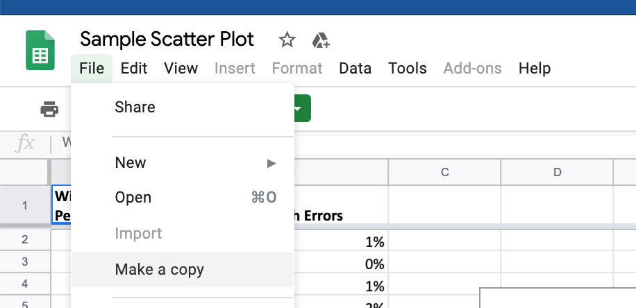
If you want to use our example spreadsheet with data you can MAKE A COPY of it by going to the master sheet here.
Then, click file -> make a copy to get your own editable version for your scatter chart in Google Sheets.
If you want to make your own Google Sheets and graphs from scratch, follow these directions below to setup your sheet.
How to Make a Scatter Plot in Google Sheets
Time needed: 5 minutes.
Quickly and easily make a scatter plot or scatter chart in Google Sheets from your data by following these simple steps below:
- Create a Spreadsheet in Google Sheets
If you need help doing this, check out this article on making your first spreadsheet in Google.
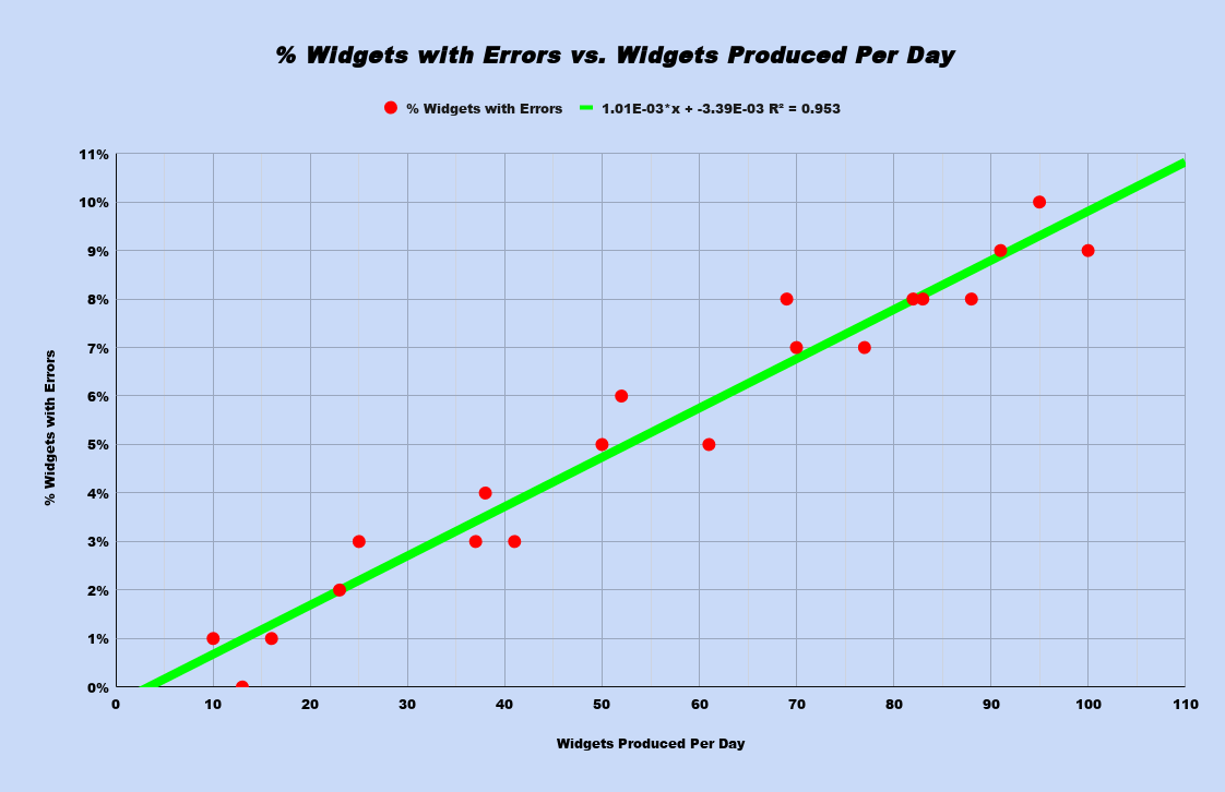
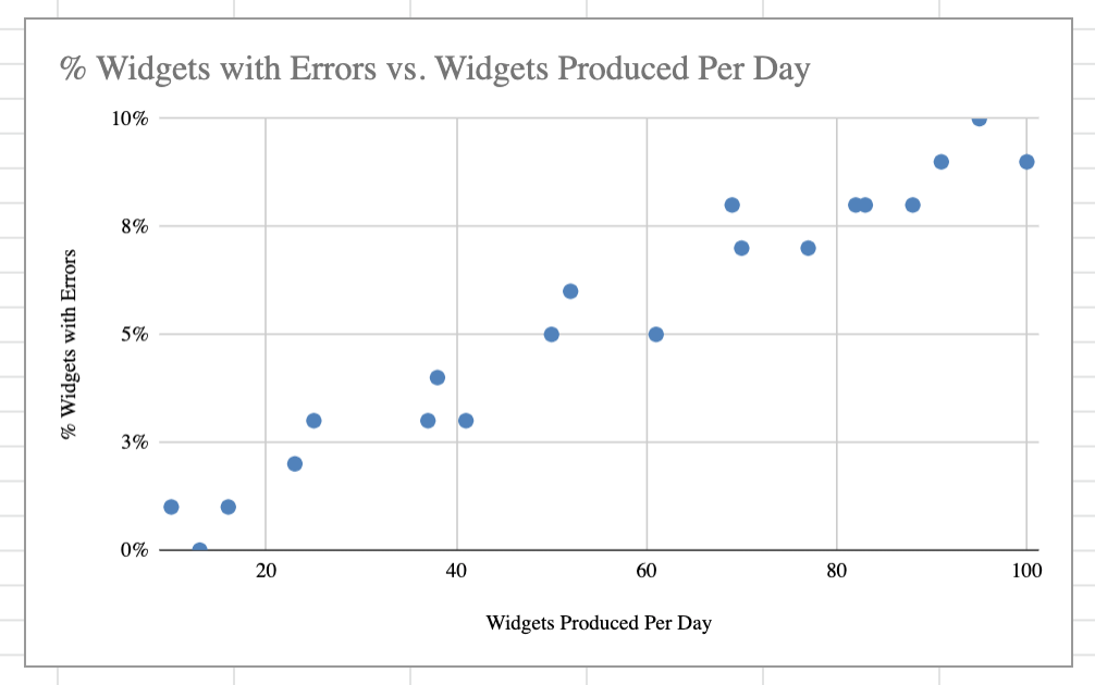
- In the 1st column, add the following data:
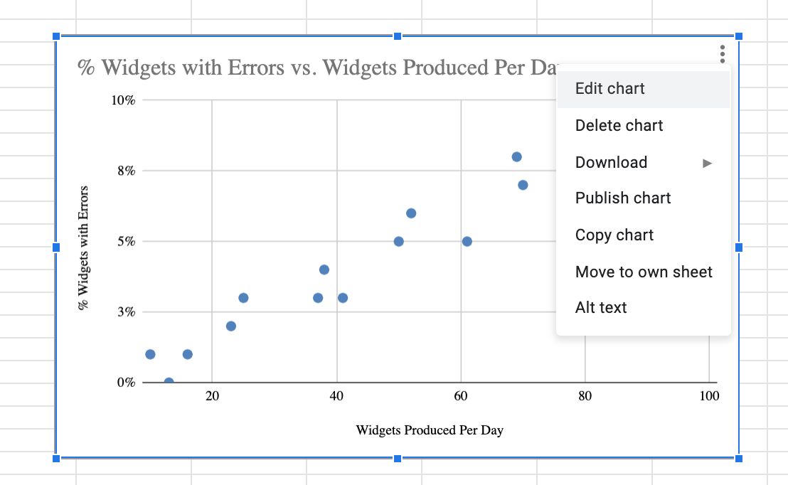
Widgets Produced Per Day
10
13
16
23
25
37
38
41
50
52
61
69
70
77
82
83
88
91
95
100 - In the 2nd column, add the following data:
% Widgets with Errors
1%
0%
1%
2%
3%
3%
4%
3%
5%
6%
5%
8%
7%
7%
8%
8%
8%
9%
10%
9% - Select your data
I recommend using “shift” + “left click” to either select the cells, or you can click the column references “A” and “B” to select the whole data set. It does not matter if you select the empty cells below the data.

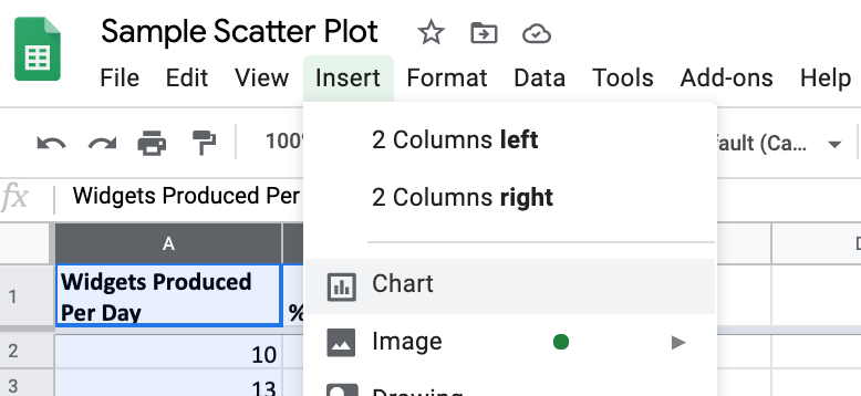
- Click “Insert” -> “Chart”
This will tell Google Sheets that you want to make a chart out of the highlighted data.
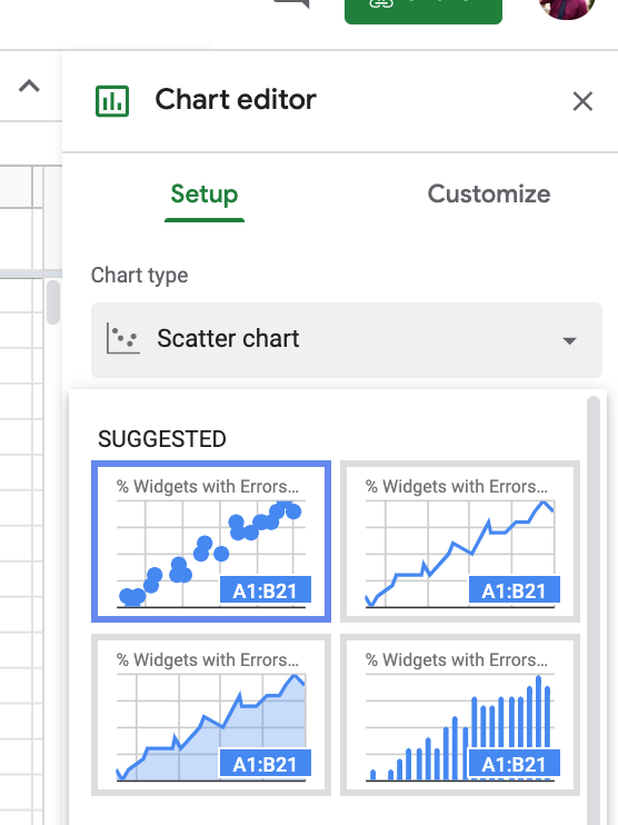
- Select Scatter Chart from the options
Reminder: scatter chart, scatter graph, scatter plot, scatter diagram are all the same thing.
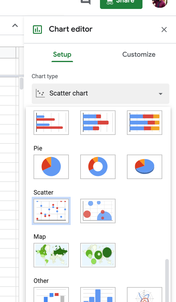
- If you do not see a “Scatter” option in the “suggested” area, you can also click it from the “Scatter” section
Google tries to guess at what kind of visual aid best fits your data. If a scatter chart is not coming up, then it is because Google doesn’t know why you want this chart. You can always click through and override their data suggestions.
- You just made your first Scatter Chart with data using Google Sheets!
Want to customize how your scatter chart data looks? We’ll get into that shortly.
How Do You Read a Scatter Diagram?
You read a scatter chart data by looking at the collective distribution of the points. From there, you will want to see if the data is correlated (is there actually a relationship between the two data sets?). If so, what direction is it, and can we interpolate or extrapolate from it?
How Can You Tell if a Scatter Plot is Negative or Positive?
The terms negative and positive refer to the correlation between the data sets.
Positive Correlation
Positive correlation means as one value goes up, the other value goes up in your scatter chart. Think about our ice cream example – the hotter it is, we expect more ice cream sales. This is positive correlation.
In a scatter plot, positive correlation traditionally means that the graph goes from LOWER LEFT to UPPER RIGHT. You can also see positive correlation from a POSITIVE slop to your trend line.
It is possible to be FOOLED by graphs with an inverted X-axis or negative X values. Make sure you learn the definition, not the visual rule of thumb.
Negative Correlation
On the flip side, negative correlation is when one number goes up, the other goes down in the scatter chart. Let’s change out ice cream for snow jackets. If temperature goes up, snow jacket sales should go down – this is negative correlation.
In a scatter plot negative correlation traditionally means that the graph goes from UPPER LEFT to LOWER RIGHT. You can also see positive correlation from a NEGATIVE slop to your trend line.
Reminder: negative means one value goes up the other goes down on scatter charts, so it is possible to be FOOLED by graphs with an inverted X-axis or negative X values.
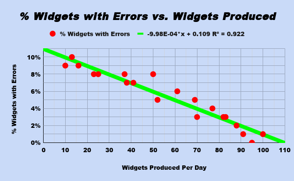
Need a concrete example of positive and negative correlation? Check out the sample google sheets spreadsheet and graphs where I have provided both as their own data sets and scatter plots for you.
Add a Trendline to a Scatter Plot
Now, you could calculate a trendline by hand but the whole point of spreadsheet programs is to help do this for us. Here’s how to add a trendline to a Scatter Chart in Google Sheets.
- Edit the Chart
- Click on the three dots in the upper right and select Edit
- Go to Customize
- Go to Series and check “Add Trendline”
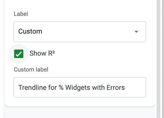
- Scroll down and check R2
- This is your correlation coefficient which tells how you well your line fits and what direction the correlation goes (positive or negative)
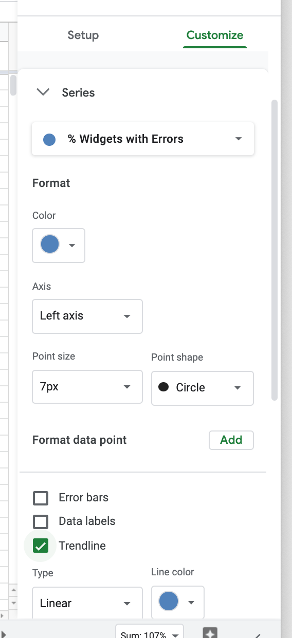
A trend line is a line through your graph that has the LEAST collective distance between all the points. In simple examples, this will be a LINEAR function of y = mx + b (y value = slope * x value + y intercept for those who do not remember the notation).
Now that we have a trendline we can use it to make some predictions.
What is Interpolation?
Interpolation means to predict data within the range of your data set. For example, if we cover widget production 0-100, we might have sampled at 10, 50, 52, 70, 100 but not 51. Well, 51 is within the range of data we have so we can use our best fit trendline, plugin 51 for X and get an interpolated prediction of what 51 might have been.
Interpolation is generally considered safe, as you have real world proof surrounding those data points. Just think, if 50 is a known value, why would 51 be very different when 52 is also a known value?
What is Extrapolation?
Extrapolation is when you go outside the range of your data to make a prediction. For example, if our widget production sample goes from 0-100, making a prediction for what happens at 150 would be extrapolation.
There is an inherent risk with extrapolating data, as you cannot confirm if your trend line maintains at that new range. What was linear for 0-100 might actually start looking exponential by the time you get to 150, and thus is no longer a good model for predictions.
Correlation Doesn’t Mean Causation
With the discussion of correlation, we can’t skip the age old adage that “correlation does not imply causation.” Just for fun, I wanted to share this website that has some humorous examples of things that are strongly correlated but are absurdly unrelated and have no causation.