I hate it when websites don’t have sticky menus. Using just a few lines of CSS you can make a sticky fixed menu. I’ve included code and samples below.
I am current’y using the Velux WordPress theme based on Primer by GoDaddy, and in general it’s really quite nice (non sponsored). There is ONE MAJOR pet peeve I do have about it though.
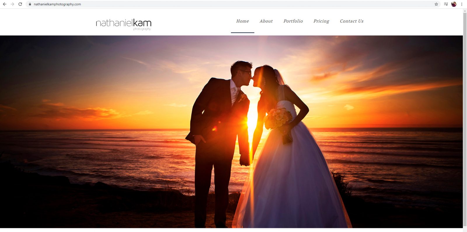
The theme does not have a Sticky WordPress Menu with CSS. What does this mean? It means when you scroll down the page the header disappears (see example below)
Page Contents
Why Your Menu Should Be Sticky
Today’s websites and blogs especially are TALL experiences. This means there is a lot of scrolling required to see all the content (especially on blogs). If you have ever loaded a page on a mobile device, you will notice this problem can triple or quadruple based on how their responsive elements are setup.
As a user, it is VERY frustrating to be midway down a page and not be able to navigate to other parts of the website. As a business, if you don’t have an immediately visible CTA (call to action) at the moment a user is making a buy decision, you are putting yourself at a disadvantage for a conversion.
This is where sticky menus come in. When a menu is sticky, it remains at the top of the website so a user never loses their navigation control.
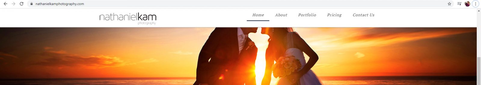
By now, you have likely noticed that my menu does stick to the top of the page. That is because I added the Sticky WordPress Menu with CSS myself. Example below:
I do not know why the option for stick menus is not just a default part of the WordPress framework or design standard for theme makers. If you work for one of the big theme publishers and know why sticky menus are not the default, I’d love to hear what the reason is.
Menu Design Considerations
Your requirements may vary, but for me I wanted the following in my sticky fixed menu solution:
- Requirements:
- Easy to implement
- Ensures user can always navigate
- Works on mobile
- Works on desktop
- Bonus:
- Reduced menu size on mobile
- Works on tablet – (we’ll go into more detail on why this is a problem in most WordPress themes)
Options for Sticky WordPress Menu CSS + JS + HTML
There are a few common options for sticky menus out there. For this site, I have opted for the most common that I have observed. As you can see when scrolling, the entire header of my site stays in place. This is by far the easiest to implement, but is by no ways the only way to maintain user navigation on scroll.
Multiple Menu Styles and Triggers
An alternative approach to a sticky header is a 2nd menu element or style after the initial scroll from page load. You can see this type on my wedding photography website.
On initial load the menu has more height to it (see below):
Once you start scrolling, the white space compresses down so the header takes up less space. This is especially useful on landscape mobile devices (see below).
While I do think this is maybe my favorite option, it is not the easiest, which is what this post is all about. This requires either some JS or twice the HTML / CSS to pull off.
The BootSrap Burger Menu
This is the default mobile menu in many responsive websites (because Bootstrap is the most popular responsive framework). So, either your website uses Bootstrap or was inspired by its ubiquity.
In Velux we have this menu for mobile responsive as well, but guess what? It doesn’t stick by default either!
I should also note that this implementation is actually the multiple menus / style with triggers taken to a more extreme level, as there are two completely separate UI’s in the code.
The Floating Menu Button
The final common menu UI is a floating menu. To see a tutorial on how to create one of these you can check out this tutorial on Medium.
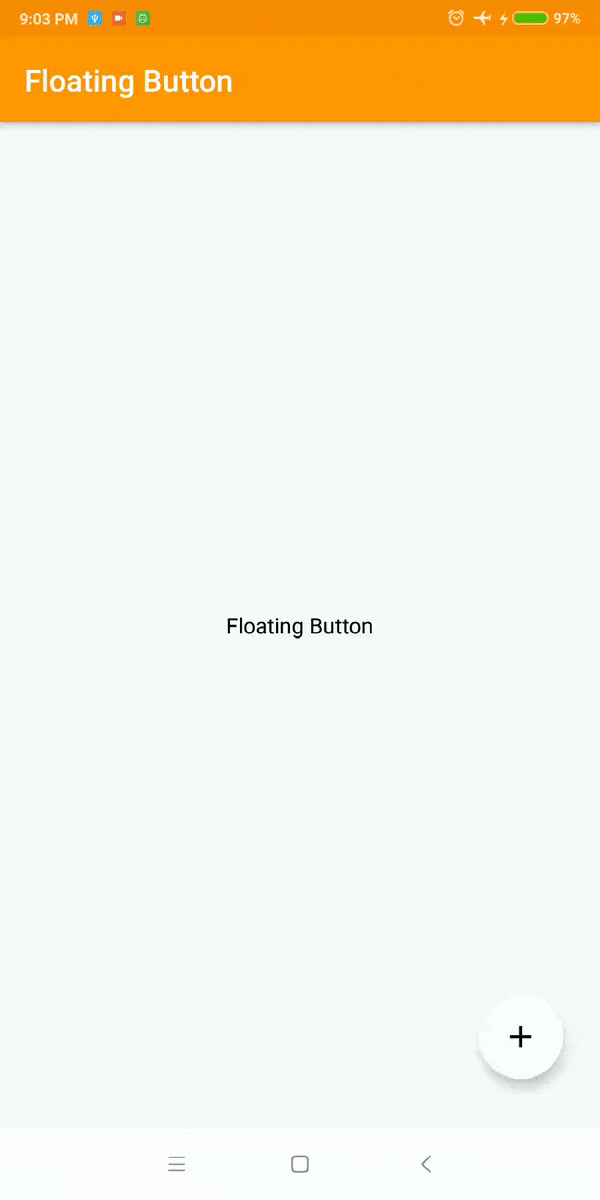
I actually think these floating menus make a ton of sense in mobile apps, as they put the interface right where the user’s fingers will be. But, they have perhaps the highest implementation cost to put in. This is definitely harder than what we are going to propose.
How to Make a Sticky WordPress Menu with CSS
For Velux, this took me 2 classes and 8 lines of CSS including brace formatting.
- Get the name of the header class or id, in Velux this is #masthead
- Right click on the blank space BEHIND your menu and Inspect Element. The whole bar will highlight when you have found the correct element.
- In your theme’s custom CSS, add a new class or id hook for the header you found and set the position to fixed with width 100% and top 0px.
- In CSS ids use a # prefix and classes use a . prefix
- Make sure no content falls “behind” the menu. Add a class .site-content and give it padding on top (how ever big your menu header is). In our case, it was 125 px.
- Save your customer CSS, purge all cache, and refresh
#masthead{
  position: fixed; /* This decouples the menu from the scroll bar */
  width: 100%; /* This ensures your header spans the whole screen */
  top: 0px; /* This ensures the menu is stuck to the TOP of your screen */
}

.site-content{
  padding-top: 125px; /* puts white space behind the menu so content doesn't fall behind it */
}
Now you have a Sticky WordPress Menu with CSS! With those few lines of CSS, you will have a sticky fixed menu on your site that gives users access to navigation no matter how long your posts are.
Tablet and Mobile Landscape Complications
Tablet and landscape mobile will generally not be perfect with this basic setup. At least they are not in Velux and in most bootstrap themes I have used – they have the same issue. This issue happens because on tablet size screens the CSS is still set to stack content rather than replace it with the burger.
The fix for this is to change the breakpoint for tablet to also use the burger menu. This requires looking up CSS hooks and making a child theme to deploy for scale and future updates. This process is currently outside the scope of this article.
For Velux specifically you will be changing all entries in the menu section of 40.063em to 60.063em.
Still Having trouble?
Are you still having trouble with getting your WordPress menu to stick? Let me know so I can update this post with details on your use case.